Monday, November 19, 2012

Graphic Playground


Graphic novels are a world of color and light. The images contained in each novel are bound only to the reality of the artists' imagination. Mice become men, creatures from other worlds invade reality in a burst of color, doors open in the sky, and bodies are distorted at the whim of the creator. 

In this set, "Graphic Playground", I wanted to explore the imaginary playground of imagery that is the world of graphic novels. By translating images from nine different works, I was able to test the limits of my photoshop and interpretive abilities. Each novel was carefully chosen for its fantastical qualities pertaining to light source, color and subject matter. 


Wednesday, November 14, 2012

Artist Analysis #9

Image from the series "Wonderland"
by Kirsty Mitchell

The set "Wonderland" was created by photographer Kirsty Mitchell as a way of honoring her mother who had recently passed away. Mitchell described her mother as a great storyteller and felt that creating a fantasy world through her photography would be a good way to keep her mother's memory alive. The entire set uses bold colors, costuming, props and location to create a story through imagery rather than words. The color purple is used to keep a running continuity throughout the images in this series.

I chose this image in particular both for its bold colors and graphic qualities. This image features a model running through a field, holding an umbrella that releases above it a cloud of blue smoke. The image is cropped in such a way that the model fills the frame from top to bottom. The background elements (the ground, horizon, and sky) recede behind her, with the horizon intersecting at the model's waist. The rows of flowers on the ground create a graphic element that pulls the viewers' eyes to center, further focusing attention on the model/actress (the heroine of the "Wonderland" story). The expression on the subject's face, as well as the cloud of smoke billowing from the top of her parasol, create the illusion of movement, giving the audience the impression that she is running from something. This image (as well as the rest of the images in the "Wonderland" series) are, in my opinion, an excellent example of a photographer's ability to create a narrative solely through imagery.


Monday, November 12, 2012

.GIF


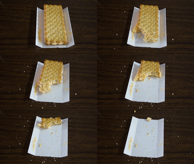
A gif of my delicious and nutritious breakfast, courtesy of the Sub Market and Ritz...

Wednesday, November 7, 2012

Artist Analysis #8


Artist Analysis #8
Morimura Yasumasa
"Exchange of Devouring" (2004)

Photographer Morimura Yasumasa stands posed on a black background, gripping the remains of a corpse as he howls into the air. His photograph "Exchange of Devouring" is a recreation of the Francisco Goya painting "Saturn Devouring His Son". Known for his recreations, Yasumasa uses a mixture of photography and digital manipulation to emulate various works by other artist. In this image, Yasumasa uses both lighting and digital enhancement to recreate the Goya painting (he also relies on the fame of the image and the audience's ability to immediately recognize the subject matter). Interestingly, Yasumasa's pose is not an exact mirror of the original work. He stands upright with one leg lifted into the air, his body facing to the right. The subject looks into the air, screaming. In the original Goya painting, however, the subject is crouched down, with his victim's remains still hanging from his mouth. It is Yasumasa's use of light and setting that most help the viewer recognize this as a replication of the Goya painting (as well as the tiny, headless body the model holds). 

Researching Yasumasa, it is clear to see a divide in the art community's feelings towards his recreations. Some do not believe that his photography can be elevated to the level of "high art" because they are merely recreations and not original works. Other's see his body of work as an appropriation of popular images. Yasumasa has also been know to incorporate audience participation into his exhibitions, once including a photo booth at his show that allowed audience members to superimpose themselves on to famous works. 


Wednesday, October 31, 2012

Not So Final Project Proposal


Laura Brunette 
10/31/12
Arts 188

Not So Final Project Proposal

A close friend of mine has just started the process of transitioning from male to female. Recently, we were discussing the relationship everyone has (transgendered or not) between the masculine and feminine aspects of their personality. For my final project I would like to explore that relationship through photography and image manipulation. I have spoken with several other friends that are willing to act as models for this project. I plan to take two pictures of each model, one representing their masculine side, and one feminine. I then plan to composite the images together to create a single image of the interaction between the two sides of each model's personality. 
In my conversations with the models I have asked them to consider what they perceive the to be the interaction between these aspects of their personality. I plan to work with the model to create an image that represents their own personal feeling on the subject. 
This project was inspired in part by the recent trend in "alter ego" photography that has become popular among celebrities (having been featured on several reality television series). It is partially inspired by Leland Bobbe's drag queen set that I referenced at the beginning of the semester. 


Wednesday, October 17, 2012

Artist Analysis #7


Artist Analysis #7
Nan Goldin
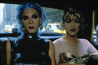
"Misty and Jimmy Paulette in a taxi, NYC" (1991)


The photograph "Misty and Jimmy Paulette in a taxi, NYC is a large scale color print (30 x 40inches) of two drag queens in a taxi. The subjects, Misty and Jimmy, fill the majority of the frame, staring directly into the camera. Both seem to have an attitude toward their photographer, as if the lens is an unwanted intruder in a private moment. This image has a snap-shot aesthetic, and the majority of the light in the image seems to be provided by a natural source (the daylight coming in through the windows). The subjects are backlit by the window behind them, but it is not over exposed, and their faces are also properly exposed. The queens provide a pop of color in the photograph (blue hair, red lips, a gold top) while their surroundings are relatively muted (except for the yellow taxis in the background, which (according to the title) are an important aspect of the image). 

I chose this photograph because, as our recent section has been about documentary photography, this was an interesting example of an image that has both documentary quality and a "staged" feel. Goldin's work often involved performers from the drag culture in New York (a group in which she had many friends). While this shot initially appears to be a moment in time caught by an objective viewer (the documentary lens), knowing that Goldin was probably friends with Misty and Jimmy, as well as the fact that the image is take from the front seat of a cab (which is not a shot that would happen "by chance"), the image then takes on a staged feel. Were the subjects coached to give attitude to the camera? Does this image accurately represent the mood of that moment? Much of Goldin's work focused on the drag culture (again, which she was personally close to), so it is clear that she was not an objective viewer. 

Monday, October 8, 2012

Artist Analysis #6


Alec (and Carmen) Soth
from "Brighton Picture Hunt"


This image is credited to photographer Alec Soth, but it was actually taken by his seven-year-old daughter Carmen. When Soth arrived in England to work on a commissioned photo-shoot in early 2010, he was denied a work visa. The photographer was told that he would be allowed into the country only under the stipulation that, were he to be caught taking photographs, he would be arrested. In response, Soth gave his camera to Carmen, and allowed her to photograph anything she found interesting. He was interested in his daughter's "open-eyed" view of the world, her lack of inhibitions, and her work, untainted by knowledge of photographic cliches. 

I chose the image of a woman walking down the street, not paying attention to the photographer (Carmen), because I think it represents the overall theme of the work that Alec Soth was trying to portray. The woman in the photograph completely ignores the photographer, looking over her, focused on her path ahead. Had the photographer been the elder Soth, the attitude of the subject may have changed greatly. A child taking a photograph is innocent, the subject can assume that there is no possibility of being subjected to a photographer's agenda. This also highlights the concept the reality of documentary photography; how real is the expression of a subject that is being  watched? How does the presence of a photographer influence the subject matter?

Technically, the image is strong (especially when you consider that it was taken by a child with no formal training). The woman's head and torso are framed in the center, making her expression the focal point. The image is evenly exposed for both the sky in the background, and the woman. The depth of field is shallow, falling off right behind the woman. Overall, this image is interesting because it illustrates the importance of context and intent in photography. The story behind the image elevates it beyond the snap-shot that it is in reality. 

Wednesday, October 3, 2012

Artist Analysis #5


Artist Analysis #5
William Eggleston "Pinball"


I chose this image because the rich color and busy background drew me in to the image and I wanted to know more about the subjects. Unfortunately, I was unable to find any information about the photography, other than it was created by Eggleston some time in the 1970s. Eggleston was known for his use of color in photography, and this image is an excellent example of that. The man in the foreground is in a bright yellow shirt which separates him from the background (a feat, considering that the rest of the image consists of brightly colored pinball machines and a busy wall of comic books/videos?). The appears to have been caught off guard by the photographer, as his hands still hold the machine suggesting that he was still playing the game. The shallow depth of field further serve to make the man in the foreground the central focus, despite everything else going on in the background. 

Tuesday, October 2, 2012

Master Painting Assignment

For my master painting assignment I chose Roy Lichtenstein's "Girl in Mirror".
I chose Lichtenstein because I really enjoy his aesthetic (as a hugh comic book fan, I love both his original paintings and his recreations). I also like that he would sometimes use his art to mock advertising and marketing, and the way they depicted women as unrealistic caricatures.

For my recreation, I used a Barbie doll set in front of a red background holding a toy mirror. The final image actually consists of three images: one with the doll's hair in focus in the foreground, one with the doll's hand/mirror in focus, and one of the doll's face which was used to simulate her reflection in the mirror. I chose to use a doll as opposed to a real person because I felt like it better represented the feeling of the original painting, which was not meant to represent a "real" woman, rather, a cartoonish and stereotypical interpretation of a beautiful, carefree woman.
During the printing process, I boosted the saturation of the colors in Lightroom in an attempt to make the image look even more cartoonish.

For my personal interpretation of the piece I created two images, each addressing a different artistic element of Lichtenstein's work. The first addressed the artist's feeling on marketing and the depiction of women in advertising. The photograph consists of two images: one of the model (myself) with no makeup or use of products of any kind, the second image was me again, but made up and heavily photoshopped to emulate the look of models in beauty advertisements.

The second image I created focused on Lichtenstein's own recreation of comic book panels. For this image, I chose a panel from the graphic novel "Asterios Polyp" because of it's bold but basic color scheme (all of the artwork in the book consists of four colors: magenta, blue, yellow and purple). I also selected this panel because it contains an obscured vision of the subject, and an inset of her face (much like Lichtenstein's "Girl in Mirror"). 

For this photograph, I placed my model on a white background and lit her with two strong side lights (in an attempt to cancel shadows and make her look two dimensional like the original artwork). Then, in photoshop, I used a layer mask to create an inset image of her face in close up (lit the same as the full body shot), converted the image to black and white, then used two masks of color overlay with the opacity turned down to create the color scheme of the original.

Were I to choose between the two interpretive images, I would pick the first because it works as a stand alone image without having to see the original. Without seeing the panel from "Asterios Polyp" the second image is not as strong.

Artist Analysis #1
 Shana ParkeHarrison "Summer Arm"


The photograph "Summer Arm" is from Shana and Robert ParkeHarrison's 2007 set "Counterpoint". It is an image of an outstretched arm held up by mechanical pieces. The arm appears to have plants sprouting from it, with butterflies, blurred in motion, enjoying the flowers. The subject is photographed on a white background, which accentuates both the bright colors of the organic matter, and the high contrast of the metallic elements. The arm and machinery occupy the lower third of the image, while the plant life takes up the middle, and the top third is mostly empty, with the exception of a butterfly. This composition seems to lend itself to the theme of the entire set ("Counterpoint") about the intersection between humans, nature, and technology. The machinery element is bleak and colorless, while the natural elements are brightly colored and almost etherial. 

In an artist's statement on their website (www.parkeharrison.com), the photographers discuss the intent of their imagery, saying that "These works feature an ambiguous narrative that offers insight into the dilemma posed by science and technology's failed promise to fix our problems…". This work in particular ("Summer Arm") illustrates this point with the stark contrast between nature and technology by dividing the frame with each element. 

Artist Analysis #2
Sandy Skoglund "The Cocktail Party"


"The Cocktail Party" a sculptural installation accompanied by a photograph with the same thematic elements. The photograph was taken in 1992, then an installment was built to replicate the image in 2011. Skoglund's work often deals with surreal metaphors to describe social situations and the discomfort they cause her. Several of her other works involve large set construction and sculptural elements.  The photograph is almost entirely monochromatic, with the exception of a few models' heads/legs emerging from costumes made entirely of "cheese doodles". The entirety of the set is covered with the dusty orange snack food. There are several mannequins that adorn the set that are covered in cheese doodles as well. The use of light, shadow, and depth of field, however, keep the photograph from appearing flat (in spite of being monochromatic). With the combination of  deep focus and high key lighting, the subjects of the photo (the party guests) pop off the background, giving the illusion of a real party in motion. 

The piece is meant to be a statement on Skoglund's social anxieties. She used cheese doodles as the medium because they are known to leave behind a sticky residue when handled. Perhaps this is how the artist feels about the after-effects of a party setting? It also seems to be a statement on the tacky nature of most cocktail parties (in the artist's view) as cheese doodles are a cheap and unhealthy snack food. What I found most interesting about this photograph is the choice of costumes for the models/mannequins. They are all dressed as if they are at a 1950's style cocktail party (complete with a Donna Reed hairstyle on the mannequin in the foreground). I feel that, as this image was created in 1992, this choice could further reflect Skoglund's feelings on cocktail parties: they are outdated, useless social exercises,  carried out by the least progressive in our culture (or, those stunted…trapped in the 1950's). I like both the eye-catching quality of this VERY orange image, as well as the social norms it scrutinizes. 

Artist Analysis #3
Sam Taylor Wood "Escape Artist"


The color photograph "Escape Artist" depicts a woman being lifted into the air at the waist by a bundle of balloons. The woman (who is Sam Taylor Wood acting as her own model) is bent in half where the balloons are tied to her, her hands and feet dangling several inches from the ground. The subject is lit from above with a spot light, while the background is in complete darkness. Aside from the balloons which are very colorful, the photograph consists of a very muted color scheme (beige, brown and white). The photograph is framed vertically to catch the ascent of the "escape artist" from her disconnect shadow, to the top of the balloons. 

Wood created this piece in response to her battle with both colon and breast cancer. In an interview with London Evening Standard, Wood revealed that she suffered several bruises and rope burns during the creation of this piece. She felt it necessary to hide her face in this shot because, not only was she showing pain in her face, but she wanted the picture to be about overcoming pain/strife, so she felt it was not important to see her face in the photo. Unlike her set "Suspended" that depict women gracefully suspended high about the floor in fluid, dance-like poses, the body shapes in "Escape Artist" are all clumsy, and seemingly out of the control of the models. This seems to speak directly to Wood's intent with the set, as she made it in response to her battle with cancer. I feel that "Escape Artist" is an incredibly strong work because it depicts the struggle that serious illness poses, along with the feeling of being helplessly dragged along in the hopes of salvation. 

Artist Analysis #4
Stephen Shores "Uncommon Places"


I was unable to find the name of this specific photograph, but it is from Shores set "Uncommon Places". It features a snapshot-like picture of a breakfast served at a diner. On the table, there is a plate of pancakes, a cantaloupe, glasses of milk and water, and paper palcemats depict Native American themed cartoons. This photograph consists of many strong graphic elements, as many objects on the table are round (the pancakes, the glasses, the half melon, the salt shaker…) but there are also several line elements (the silverware, the wood grain of the table, the square place mats). There are pops of color throughout the photo, but just like the many diner dishes it represents, the overall color scheme of the photograph is varying shades of brown. 

This photograph was appealing to me because it is a very familiar image. Though it is Shores specific encounter with a specific diner, it is taken from the perspective of someone sitting down to eat a sad diner breakfast. No attempts seem to have been made to tart up the food in the same way food photographers do. The butter on the pancakes has melted, leaving a mushy dark hole in the center of the photographer's breakfast (delicious!). This realistic approach give the photograph a relatable quality, as if it could be a snapshot from anyone's road trip. The photograph offers a nostalgic and comforting feeling by simply being simple. 

Friday, August 24, 2012

First attempt at a blogger post...

So. here's my first post. My URL, westminster-origami, refers to the name of my animation production company (and by "production company" I mean the name I put on the slate at the beginning of all my stupid animated shorts). I figured if I wanted to use this blogger profile after the class is over, I should pick a cool URL.

Anyway, on to photography!

I took this picture with my Canon Rebel t2i when my sister was visiting this summer. This was my nephew Joseph's first hair cut and my sister asked me to take some pictures for her. Like I said during my introductory presentation, I am NOT a photographer by any stretch of the imagination, but I'm trying to learn. 

This was the best picture from that day (in my opinion). It was difficult to find the right settings to shoot with because of the light from the windows. I didn't want the background to be blown out, but I wanted  the foreground to be well lit. It was also difficult to get a good picture of both my sister and Joseph at the same time (he'd look away, her face would be covered, etc.). If I were to edit this photo I'd probably enrich the color a bit (it seems sort of monochromatic to me). I'd also try to adjust the exposure of the background (since it's overexposed). 


I'm really looking forward to learning more about photography this semester!

-Laura